 TrialCurve
How to read a Kaplan–Meier curve
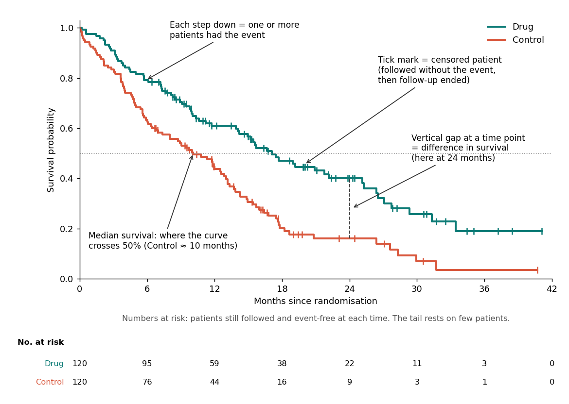
A Kaplan–Meier curve shows the proportion of patients who have not yet had the event (death, progression, relapse) over time. It starts at 100% and steps down each time events occur. Tick marks show censored patients. The median is where the curve crosses 50%. The vertical gap between two curves at a time point is the difference in survival at that time. The numbers-at-risk table tells you how many patients support each part of the curve.
Step by step
- Axes. The y-axis is the probability (or percentage) event-free; the x-axis is time since the start of follow-up (usually randomisation). Check whether the y-axis is 0–1 or 0–100%.
- Steps. Each drop is one or more events. Big drops mean many events at once, or few patients left at risk.
- Tick marks. Censored patients: they left follow-up event-free (the study ended, or they were lost to follow-up). Censoring doesn't lower the curve, but it shrinks the number at risk.
- Median survival. Draw a horizontal line at 50% and read off where each curve crosses it. If a curve never reaches 50%, the median is "not reached".
- Landmark survival. Read each curve's height at a time point (for example 12 or 24 months) to get survival at that landmark.
- Gap between curves. The vertical distance at a time point is the absolute difference in survival. Curves that separate early and stay apart suggest a durable effect. Curves that cross or separate late suggest non-proportional hazards.
- Numbers at risk. Patients still followed and event-free at each time. When they are small, the tail is uncertain and a single event causes a big drop.
- Confidence bands (if shown). The uncertainty around each curve; they widen as the number at risk falls.
Common mistakes
- Over-reading the tail. The last few steps may rest on a handful of patients.
- Treating the HR as a single number when the curves cross. A hazard ratio summarises the whole curve and assumes proportional hazards. See hazard ratio interpretation and the RMST calculator.
- Comparing medians across trials without considering follow-up and populations.
From reading to analysing
Need the numbers behind a published curve? Reconstruct the patient-level data from the figure. Have your own data? Draw it with the Kaplan–Meier curve generator.
FAQ
What does a tick mark on a Kaplan-Meier curve mean?
A tick mark shows a censored patient: someone who left follow-up without having the event, for example because the study ended. The curve does not drop at a tick, but the number at risk decreases.
What does 'median not reached' mean?
The Kaplan–Meier curve never fell below 50% during follow-up, so the median time to event cannot be estimated yet.
What is the numbers-at-risk table?
The count of patients still being followed and event-free at each time point. It shows how much data supports each part of the curve.
Reconstruct IPD from your own figure. Upload a Kaplan–Meier plot and get curves, numbers at risk, pseudo-IPD, hazard ratios and a validation pack. Three figures a month are free.
Try the live demo Browse trial data API docs